
Choosing Colors for Your Website and Brand
Choosing the right colors is an essential part of identifying your brand and website. Colors play a crucial role in defining the mood of a specific space, such as a website, and can influence customer opinion. Colors hold a particular power over a person’s subconscious and can impact perception in a way that is difficult to comprehend fully. As such, it’s important to consider each shade carefully before choosing colors for your brand and website.
Different types of colors have different meanings, and these characteristics should be considered when creating a brand identity. For example, red can be seen as the color of blood, sacrifice, and danger. On the other hand, green is associated with nature, growth, and springtime. When choosing colors for your brand or website, it’s important to remember how they will be viewed online and offline.
For e-commerce websites, it’s best to use neutral shades that are warm and inviting. This is especially true for e-commerce sites where buyers may not see the product before making a purchase. Neutral colors will allow them to feel welcomed and subconsciously invite them to stay and look around. For images, use ones that showcase primary colors of contrasting shades – think blue, orange, or green instead of red.
Color Palettes Create a Mood
Choosing the right color palette is equally as important as choosing the color itself. Different shades can evoke different feelings – while one shade of green can make someone feel comforted, another may evoke feelings of excitement and tension.
Choosing colors carefully is necessary as some colors may not be suitable for specific situations. For example, you wouldn’t want to use a bright orange in an office setting as it could distract visitors and employees alike. Similarly, you wouldn’t want to use light brown or gray in an outdoor space because they are too subtle and would receive little attention from passing pedestrians.
Website Colors Tell a Story
Website colors can evoke emotions subconsciously in your visitors and often are the first impression your visitors will have of your brand, so it’s important to choose the right colors to work with. Some colors can be interpreted as inviting and calming, while others may seem stimulating or intimidating.
A good way to personalize your website is by choosing colors that tell a story about your brand. Before choosing which colors to use on your website, consider your target audience. For example, if you’re targeting adventurous and free-spirited millennials, green would be an excellent choice for the design of your website, as green can be associated with nature, tranquility, and growth.
If you’re targeting a particular audience based on their demographics, paying attention to the colors they tend to gravitate towards is important. Mature audiences may appreciate color palettes that are practical and comfortable, while younger generations may favor colors that are bright and bold.
When choosing colors for your brand, you should be aware of how they may be interpreted online and in their physical space by customers.
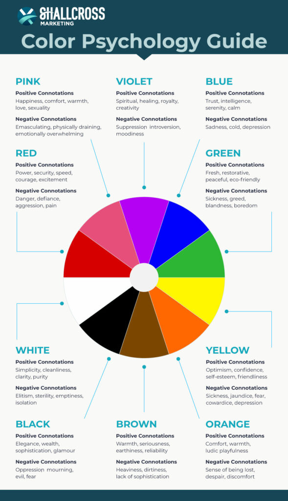
Red Can Mean Excitement and Love
While red is often associated with danger, it can also signify positive feelings. For example, red can be tied to feelings of excitement, love, and enthusiasm. It can be used to foreshadow that something exciting or romantic is about to take place.
Because red can be used to show strong emotions in both a positive and negative light, it’s not always the best color to use as part of a brand. However, if you decide to use red as part of your brand identity, it’s best to choose secondary shades such as violet or orange.
Orange Gives a Friendly and Confident Tone
If you want your brand to evoke feelings of comfort, confidence, and friendliness in your audience, orange is the perfect color to use. Orange is often associated with uplifting emotions such as optimism and energy.
You can use orange as a primary or accent color in your website’s color palette. Either way, orange will leave your customers feeling confident in your brand.
Purple Resonates with Royalty and Wealth
Purple is often classified as a rich color that signifies royalty and prosperity. It can also be used to imply wisdom, independence, creativity, and mystery. If you want your brand to be seen as respected and influential, then purple may be the right color to choose.
Additionally, if you want your brand to have an air of mystery behind it or you’re marketing toward a creative audience, purple can also be an excellent choice to have in your color arsenal.
Green Represents Health and Nature
When you look at the color green, what is the first thing that comes to mind? Nature. However, that’s not the only idea that green represents. Green is also associated with health, growth, and luck. Most of the time, green evokes feelings of tranquility and calmness and can leave people feeling refreshed.
In a negative light, green can also represent envy and disease. If you decide to use green for your brand identity, be sure to use it appropriately and play around with the different shades or secondary colors, such as yellow and orange.
Brown Symbolizes Simplicity and Dependability
Brown is often associated with earth tones and is considered a “safe” color to use on websites because it represents simplicity and dependability. This makes it a popular choice for many websites and brands to use as a primary or accent color.
Brown tones can also be seen as comforting and warm and can be a great color to use when designing websites that handle emotional concerns, such as those relating to healthcare.
Black Can Be Viewed as Dramatic or Sophisticated
Black is a common choice in marketing and web design. It’s often associated with sophistication, luxury, elegance, and power and can instill a dramatic flair in your brand. It can also be considered a color with a “lack of detail,” making it ideal for use in print ads or on websites where aesthetics are prioritized.
Black is considered one of the great colors in marketing because it has many connotations that can easily resonate with consumers. The color black even has psychological effects on people and influences their moods and perceptions in powerful ways.
For example, when people are exposed to black ink on paper, they subconsciously think about death and endings. This natural association could influence consumers to make emotional decisions, such as buying things they wouldn’t usually buy or not buying things they might otherwise want.
White is Simple and Clean
White signifies simplicity and cleanliness and can be seen as a “pure” color. White can also be used to create contrast and improve readability.
However, white isn’t always the best choice when it comes to colors, especially for brand identities. White can be too stark or too generic. For example, social media pages with white backgrounds will look like commercial sites if the content doesn’t help differentiate your brand from other websites.
Use white sparingly and as an accent color, but don’t rely too heavily on it.
Blue Implies Trust and Competence
First impressions are important and if you want your visitor’s first impression of your brand to be trustworthiness and competence, consider using blue in your color palette. Blue is a strong color that can signify trust, safety, and sincerity. It can also represent intuition and intelligence and evoke feelings of sensitivity and calmness.
In the workplace, people may perceive a man in a navy suit as being more intelligent than someone wearing red or green. People generally tend to feel more trusting towards people wearing blue-gray or light brown because it signifies a trustworthy and safe person, whereas red can be seen as an aggressive or domineering color.
Yellow Embodies Joy and Happiness
Yellow evokes joy and happiness in individuals and is often associated with the sun, which can signify energy and optimism. It’s a great color to use to instill a joyful message across your brand and website or to offer your website and visitors some extra encouragement.
Yellow also evokes nostalgia and can be used to recall memories. This can come in handy if your brand or website is a tribute to life-changing moments like births or marriages. To anchor your brand’s colors, choose a shade of yellow that people associate with something positive.
Yellow is also seen as an attention-grabbing color. Use it in contrast with other colors for the best result. However, be aware that yellow can also signify negative emotions, such as jealousy and danger, so be careful where and how you use yellow in your brand.
Choose Your Color Carefully
Choosing the right color and shade for your brand is essential to building your brand in a positive light. As you can see, colors can evoke both positive and negative emotions in a person. While it’s hard to tell how a certain color will influence an individual person, many colors are interpreted the same by several people. Avoid colors that are linked to strong and sometimes negative emotions, such as red, and stick with colors or shades that evoke feelings of calmness and warmth. Also, consider your target audience and the feelings you want to evoke. These factors will help you choose the best color palette for your brand identity.